¶ Jornada typography
Client Diario Jornada
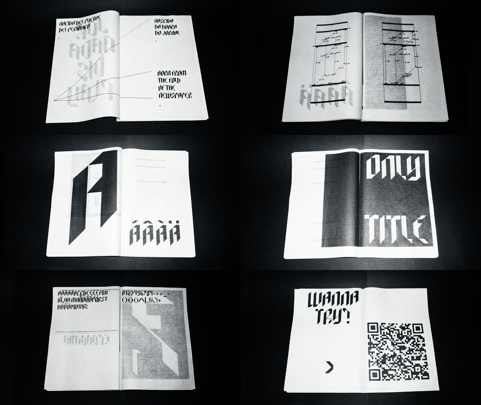
As part of Diario Jornada’s rebrand,
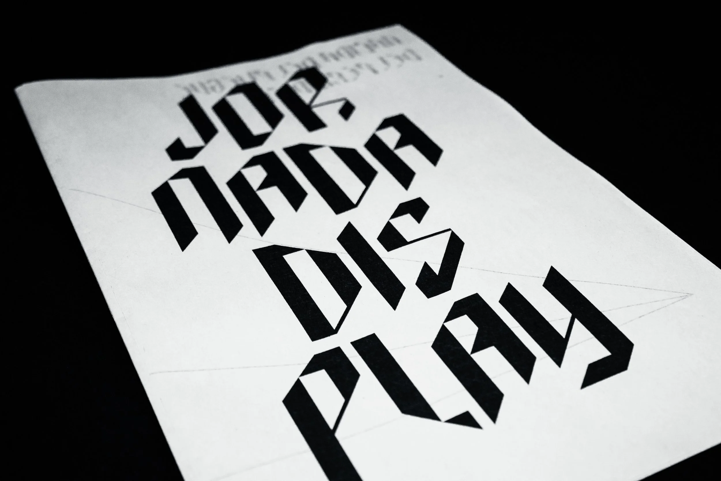
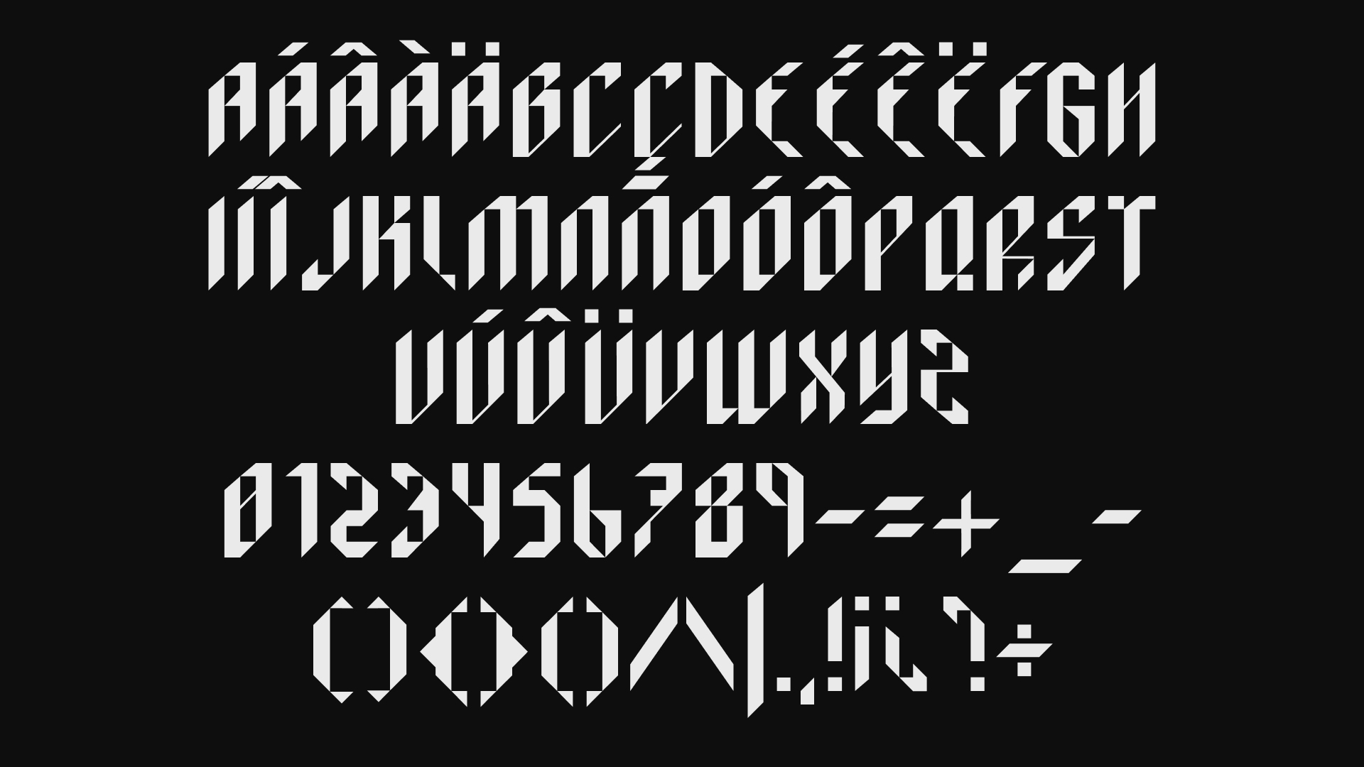
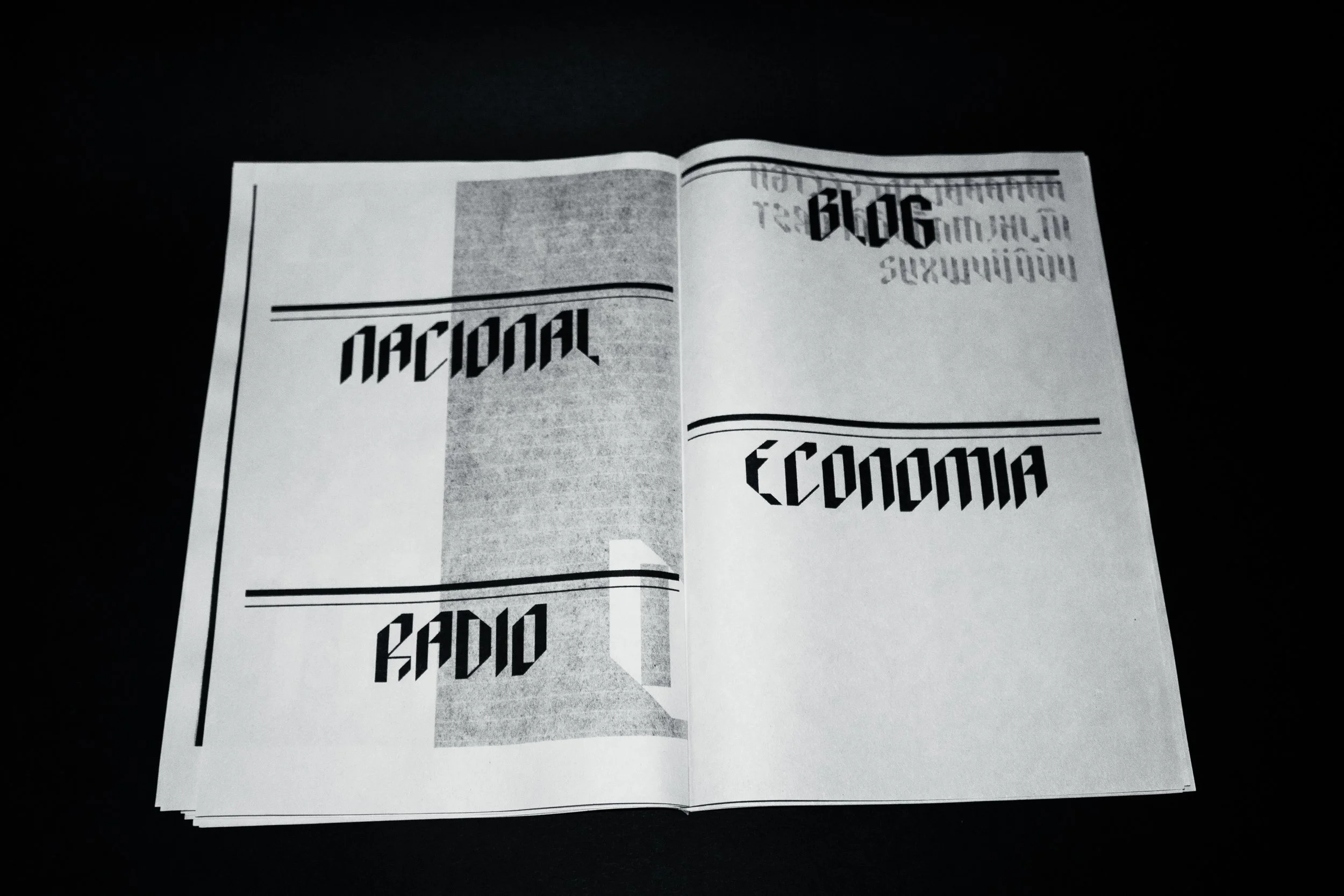
we created a custom typeface designed specifically for headlines and the new
visual identity.
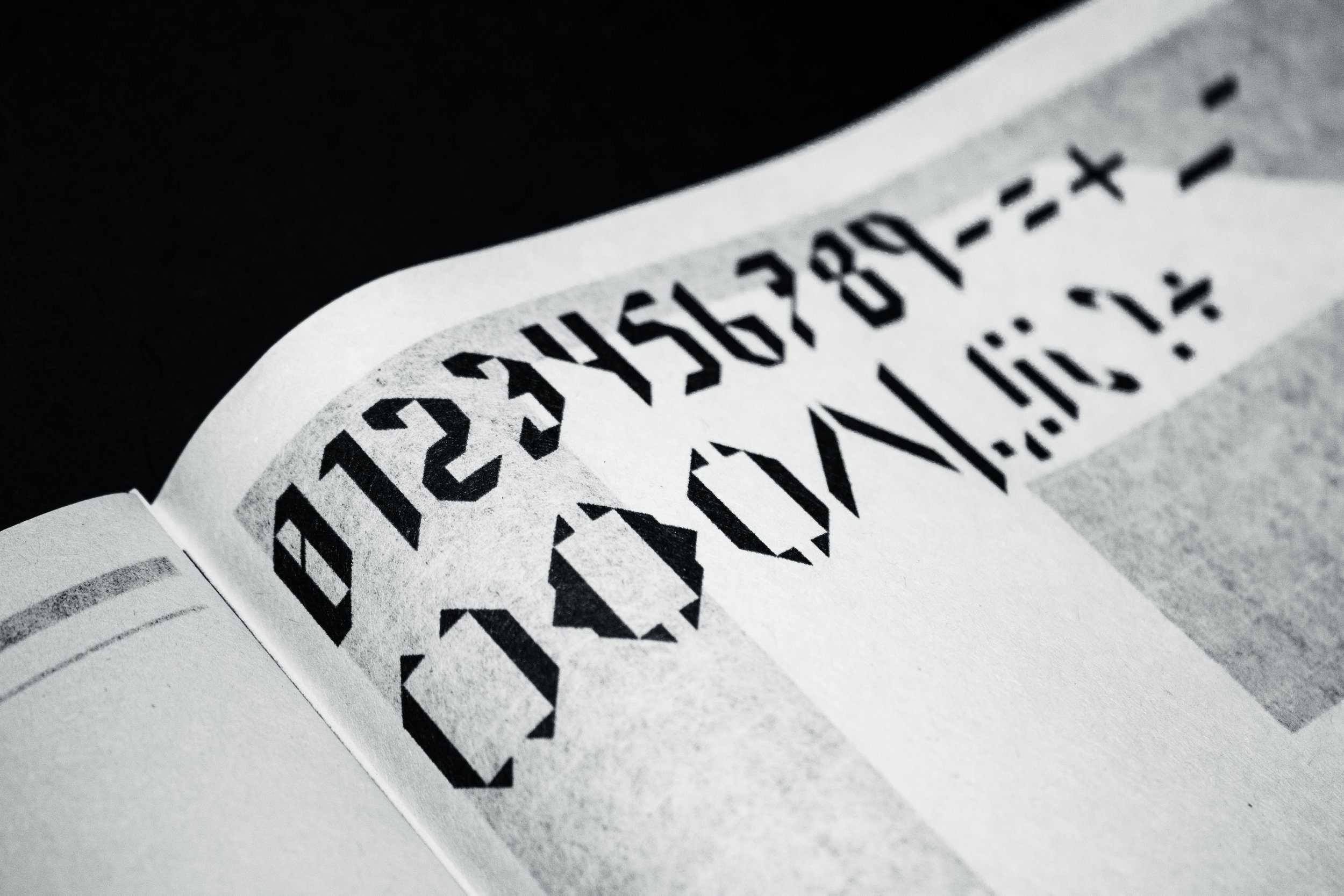
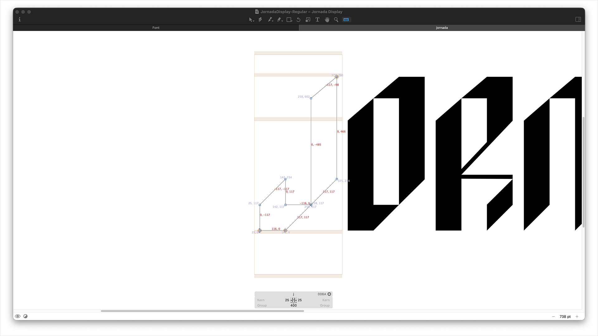
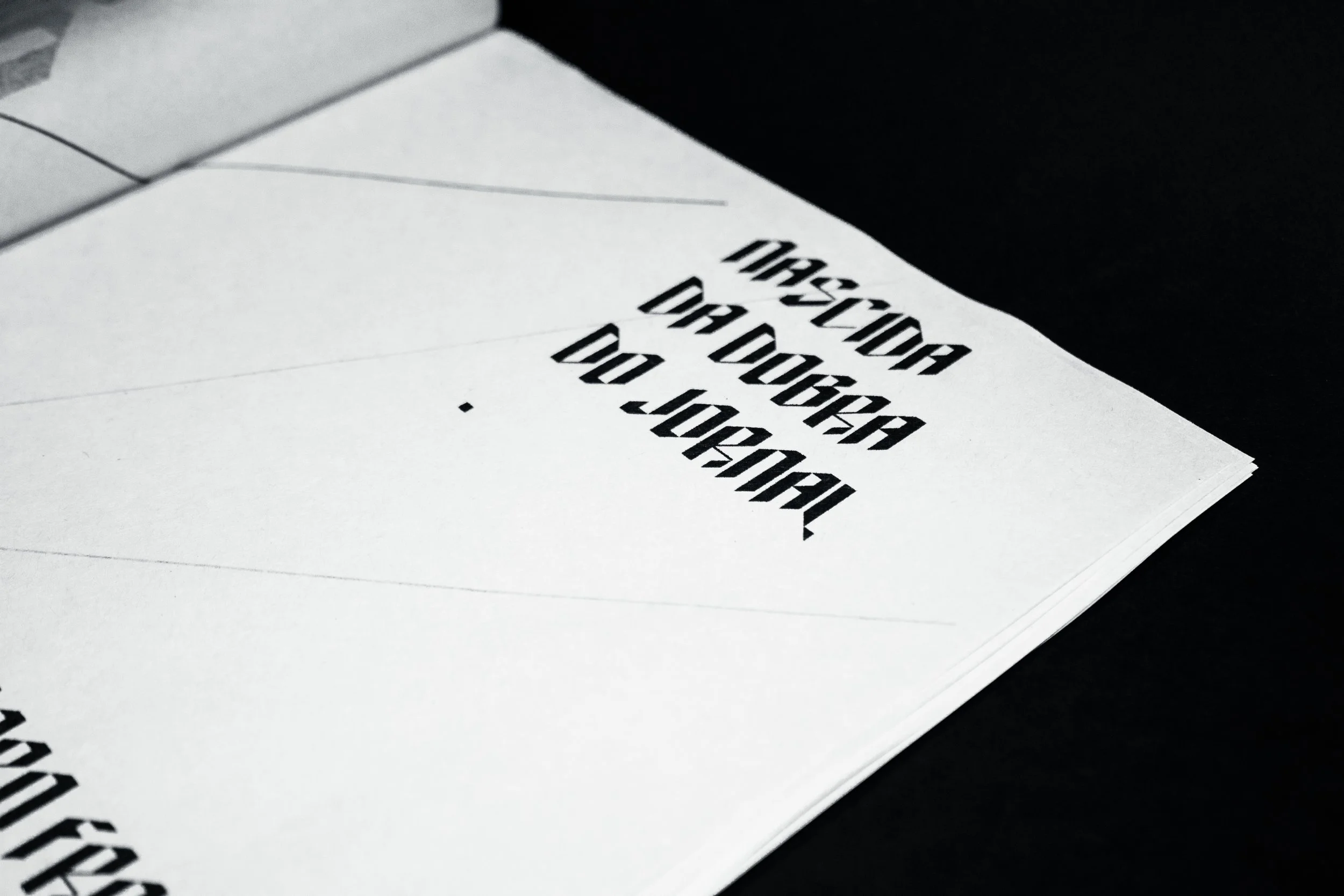
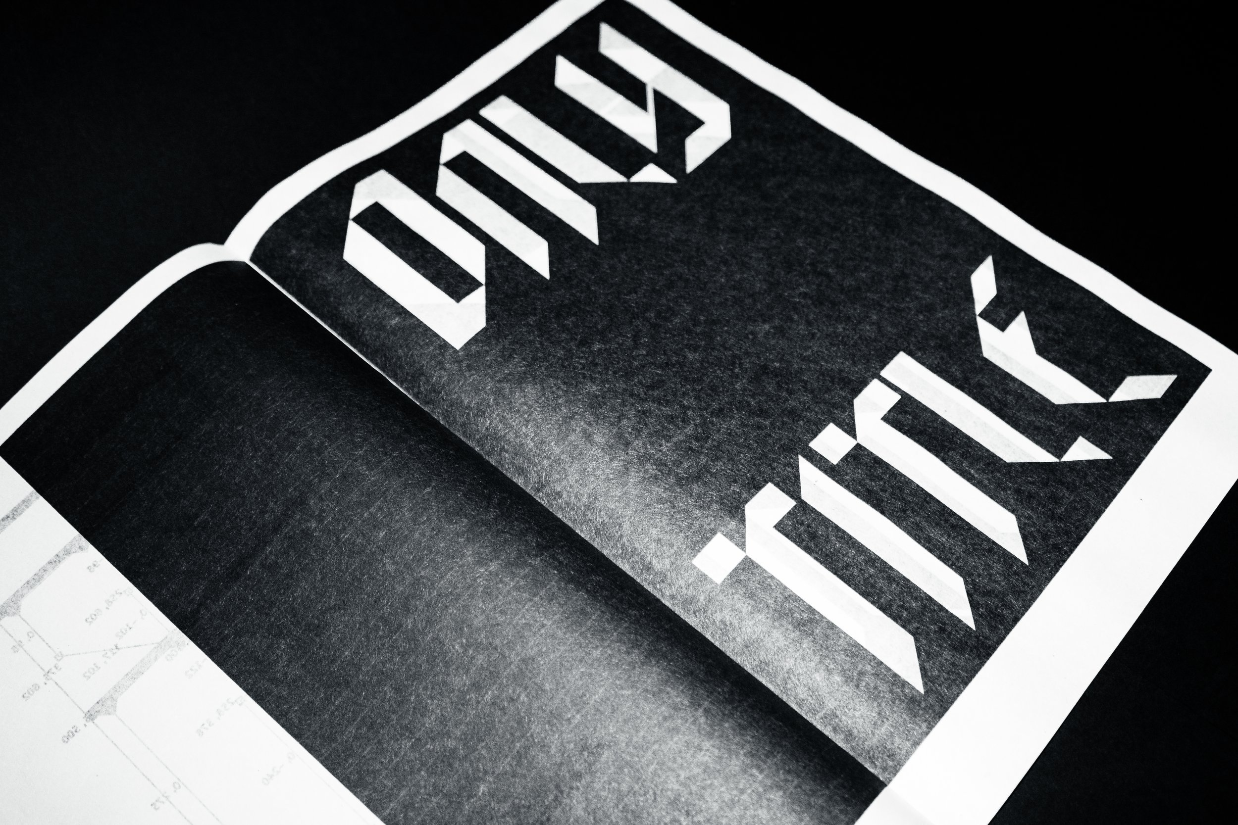
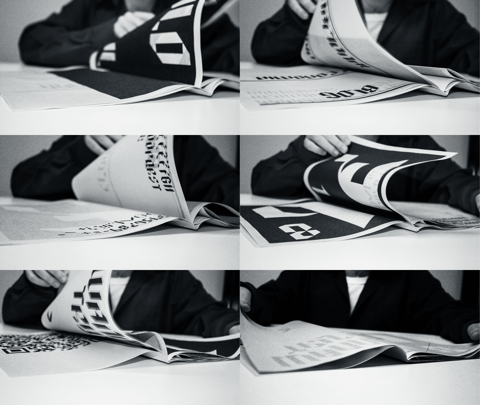
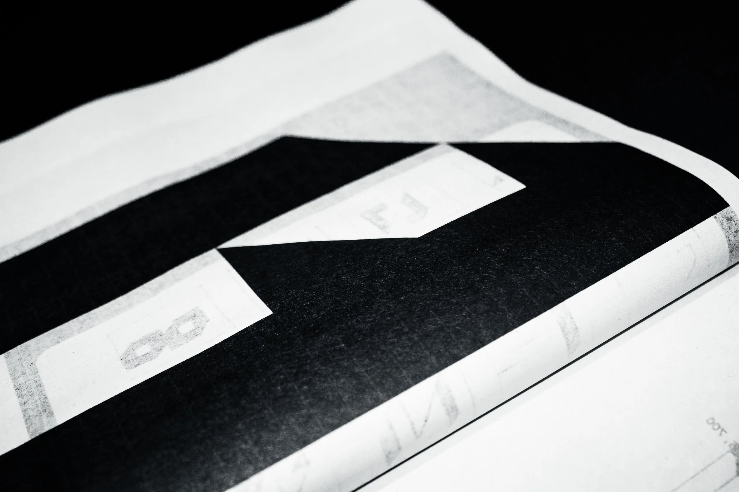
The typeface draws from two defining elements of the newspaper: the bold, condensed forms of traditional Gothic newspaper type and the physical gesture
of turning and folding its pages.
These two references became the foundation of the design. The sharp, structured shapes evoke the newspaper’s editorial heritage, while the folds
introduce movement, rhythm and a sense
of transformation.